THE IDEA BEHIND "THE URBAN SACRED"
From the very start of the “Iconic Religion” project, the team of researchers had been planning to show their work to the public by ways of an exhibition.
The communications agency FLMH Labor für Politik und Kommunikation from Berlin was commissioned with the task to develop a concept for how to present the abundance of research and artistic material that had been produced.
In order to adapt academic work to fit the purpose of an exhibition, they were faced with a twofold challenge: For one, FLMH needed to reduce the material and cluster the selected aspects. At the same time, they had to make sure that the complex relationship between urban space and religion was presented in a way that would be accessible to a wide audience.
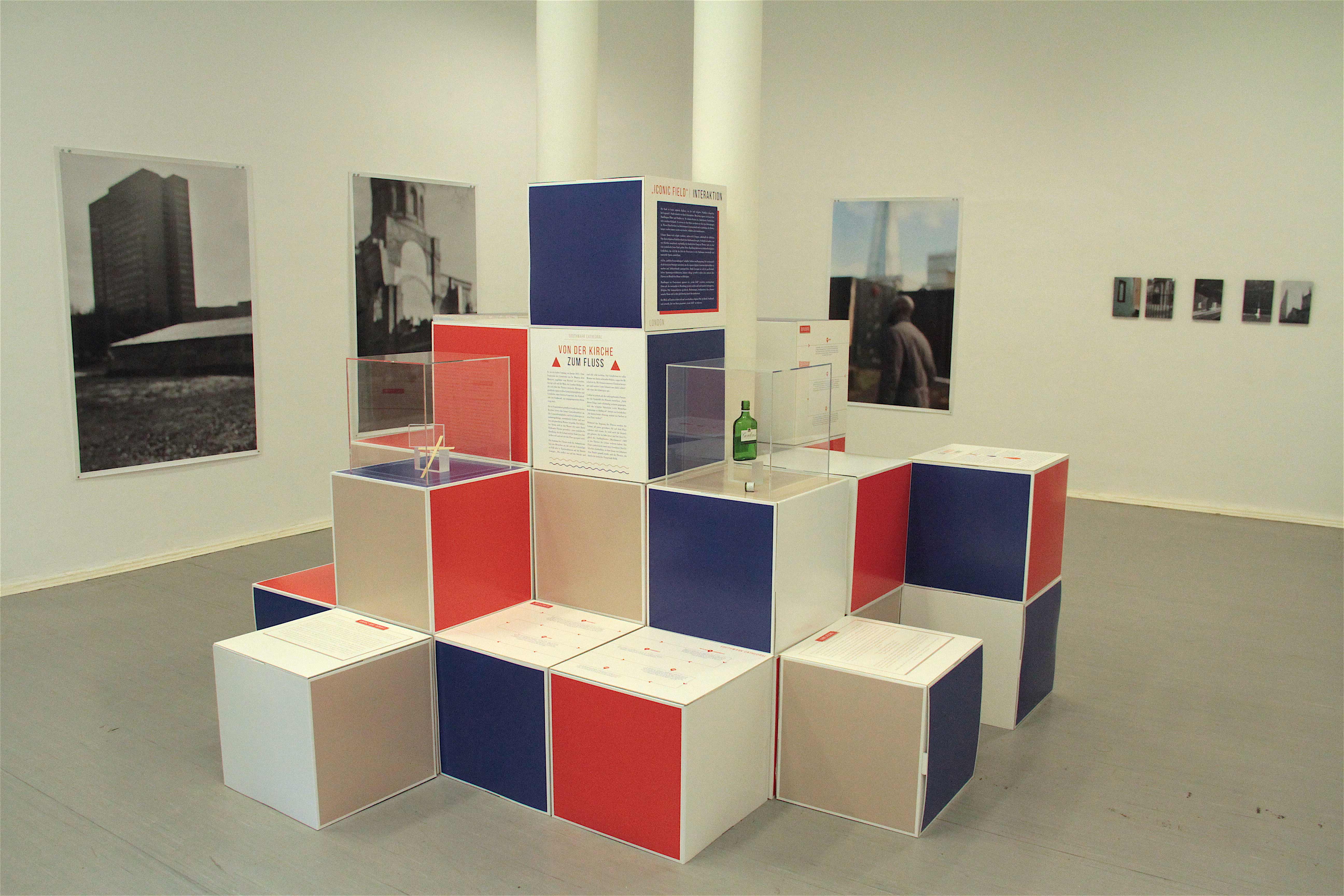
As three religious sites in each of the three cities were the centrepieces of the research, it was decided that they would also serve as the exhibition’s focal points.
Approaching the material from a visitor’s perspective, they drafted two concept papers. Based on these drafts, they developed the final exhibition concept together with Susanne Lanwerd and the research team, and subsequently proceeded to create a design for the exhibition.
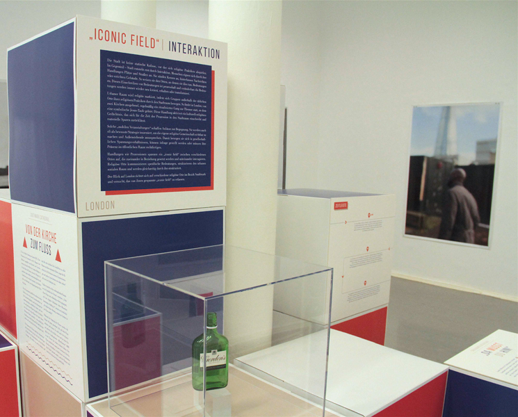
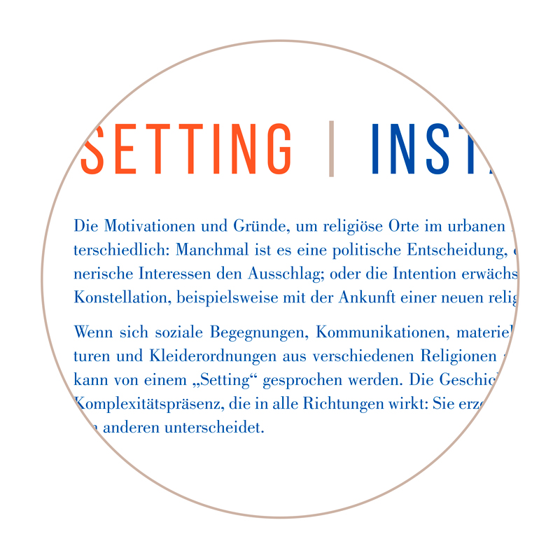
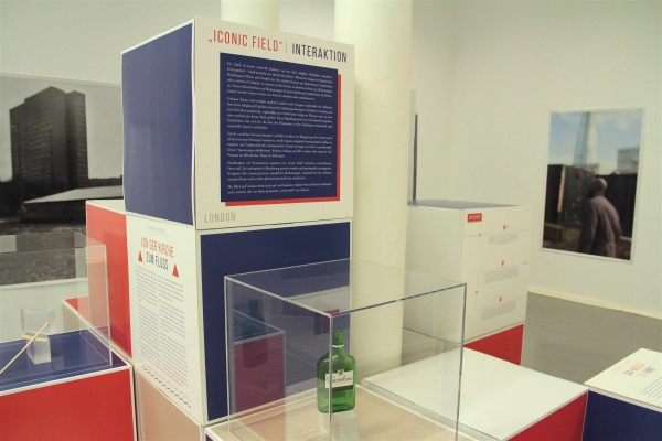
For visitors to understand how the researchers approached their subject matter and which particular aspects of the relationship between religion and urban space they had looked at, FLMH decided to give each city a theme: Interaction for London, Conversion for Amsterdam, Installation for Berlin.
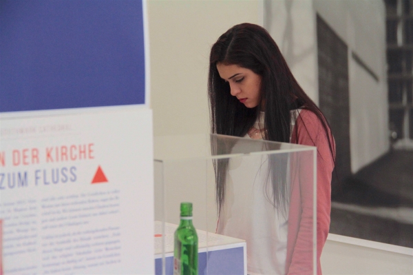
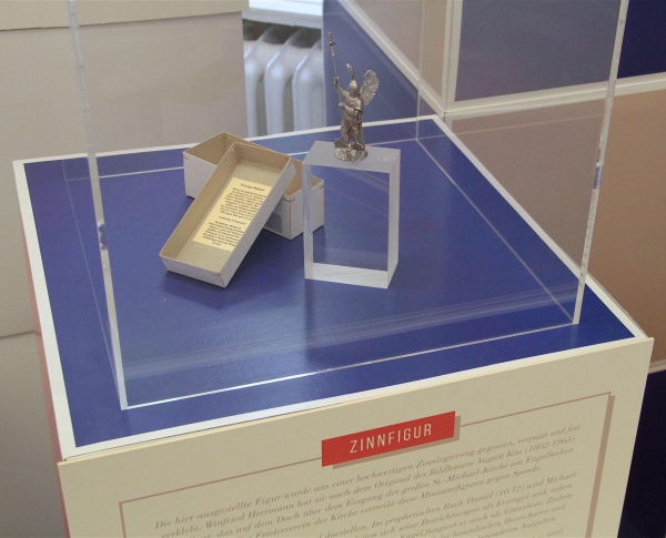
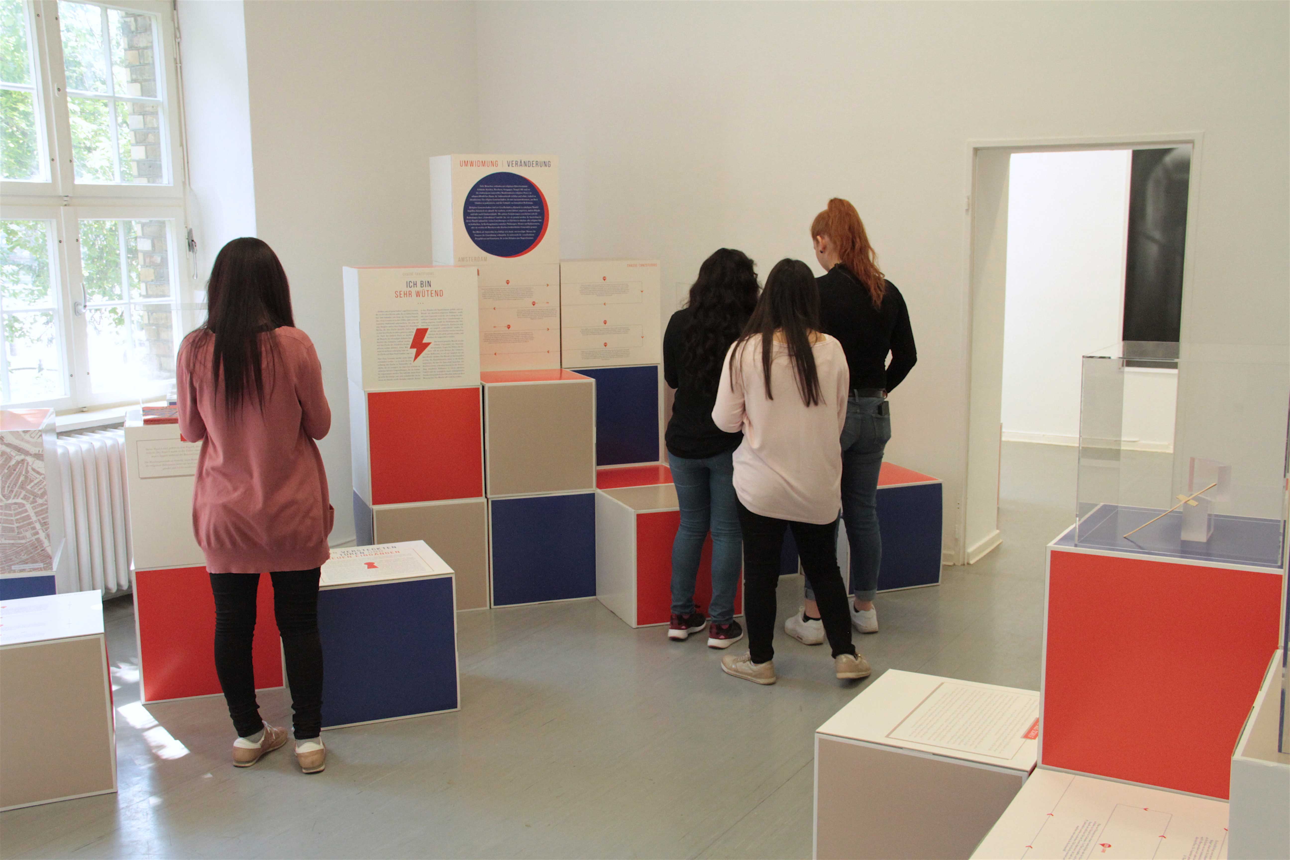
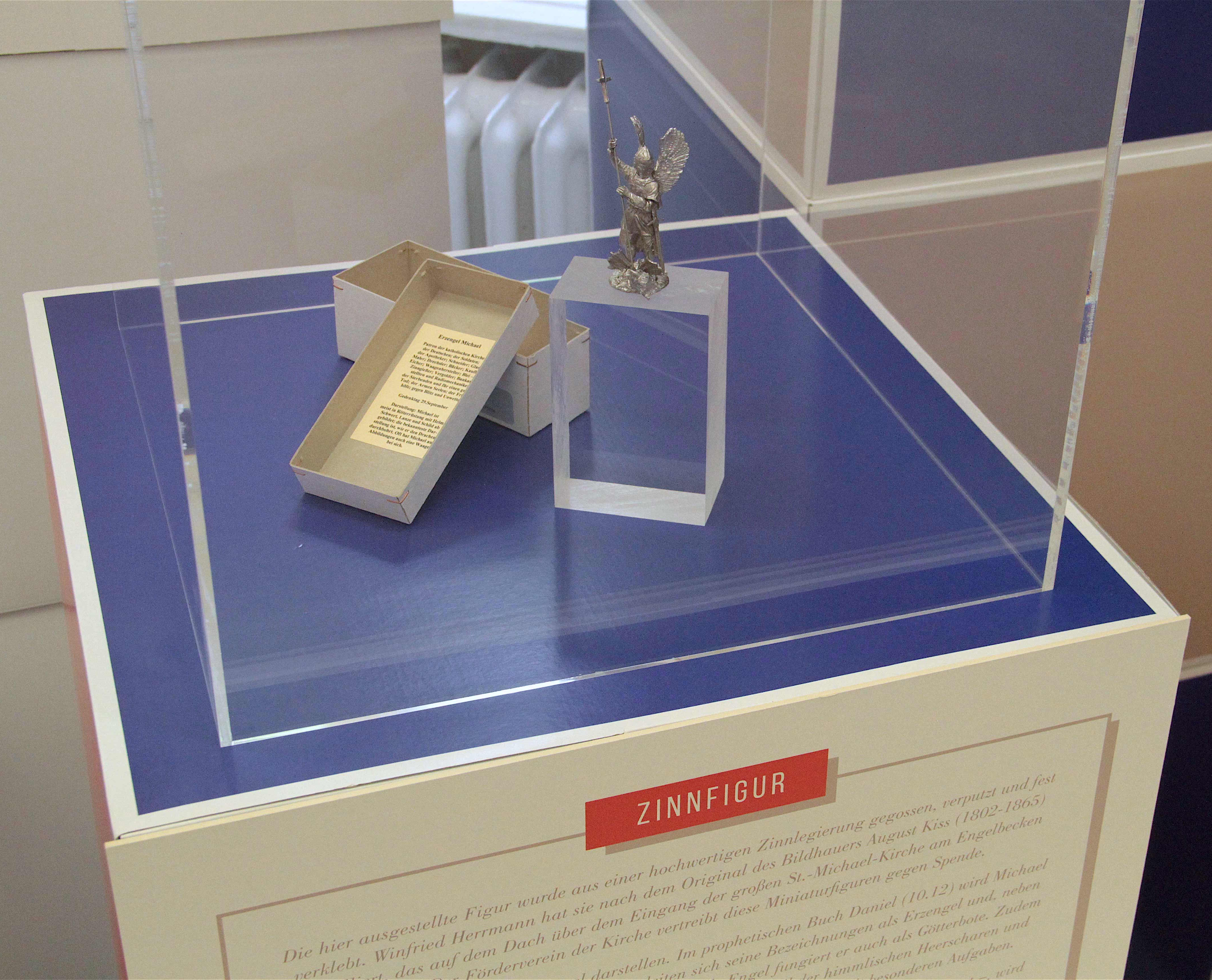
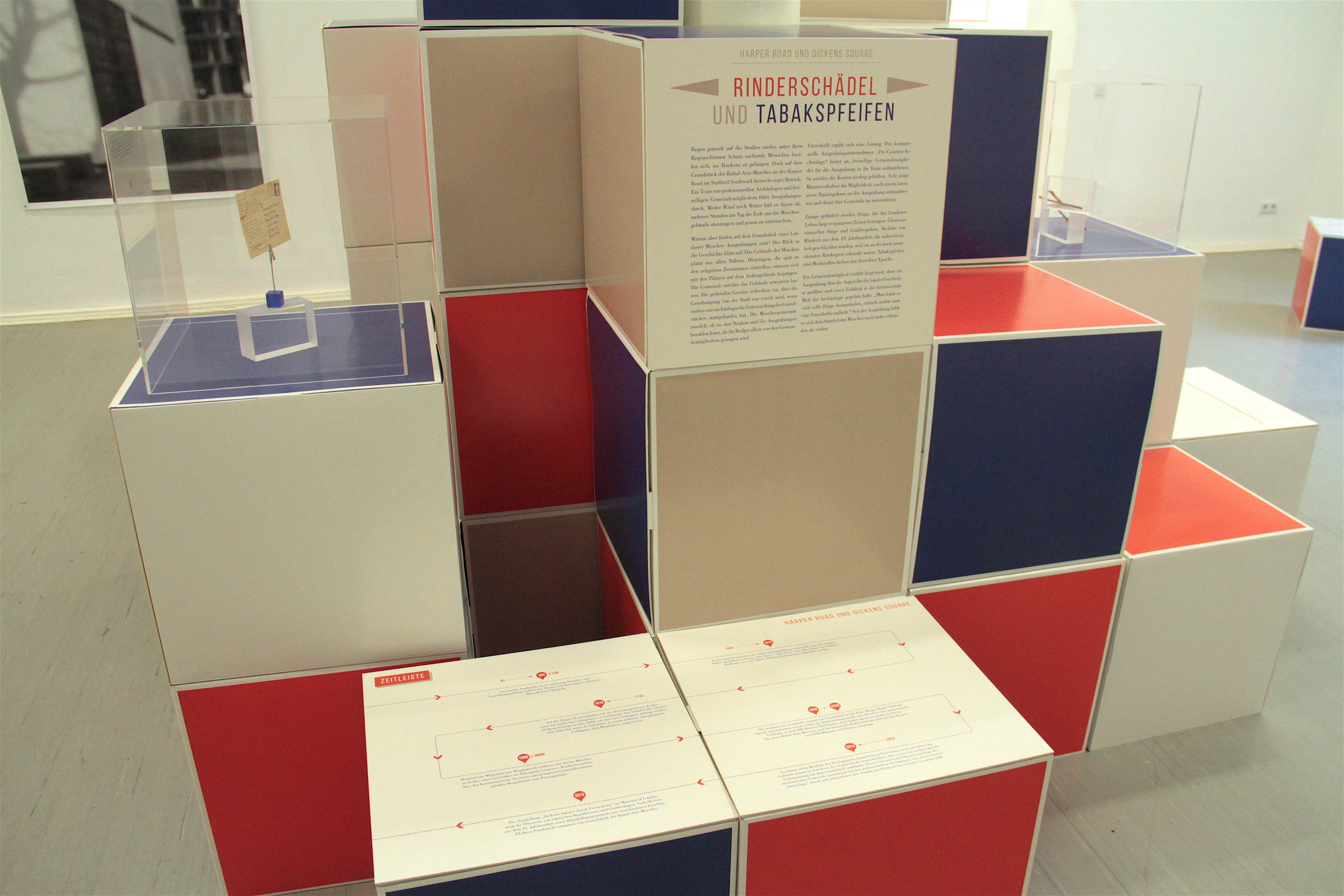
To make the histories, meanings, and the social and religious significance of the sites more tangible, different formats were created. Maps of the neighbourhoods help to locate the sights in the respective city. Timelines provide insights into the sites’ histories. Short stories engage with the sites on a personal level and tell the visitors about their significance for the respective religious and/or urban communities. Objects, presented underneath glass cubes and accompanied by descriptions, serve to dissect layers of religious meanings, or to visualise and explain processes of change, e.g. the sites’ secular repurposing.
When developing ideas for how to present these different items and which material to use, it was important to make sure the exhibition would be adaptable to four different spaces, and would have to travel to three different countries. FLMH wanted the material to reflect the transient nature of religious visibility and meanings in urban space as well as the ever-changing forms of urban space itself.
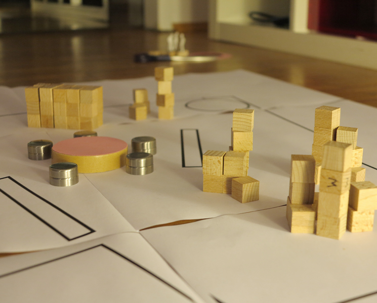
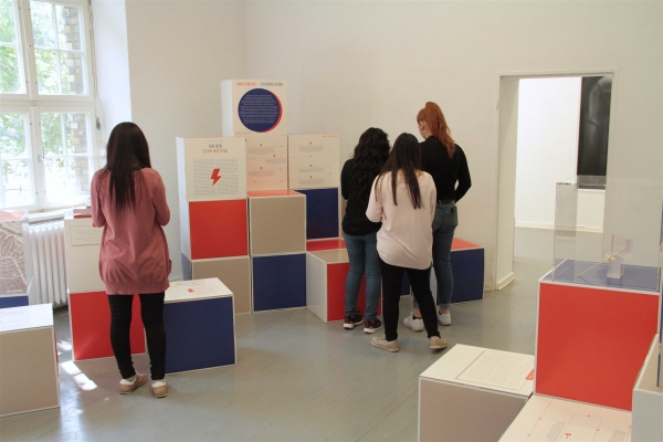
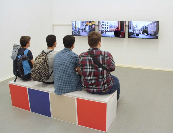
The choice of 50x50cm cubes made it possible to “build” the cities in the exhibition and to create structures that fit each exhibition space.
The text panels were attached to the cubes using double-faced adhesive tape.
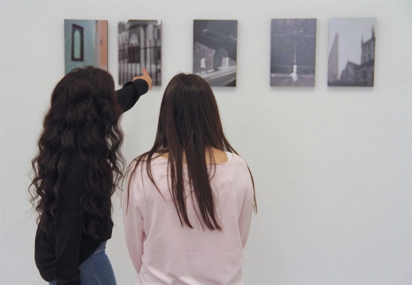
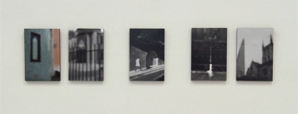
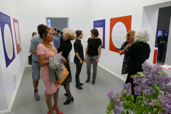
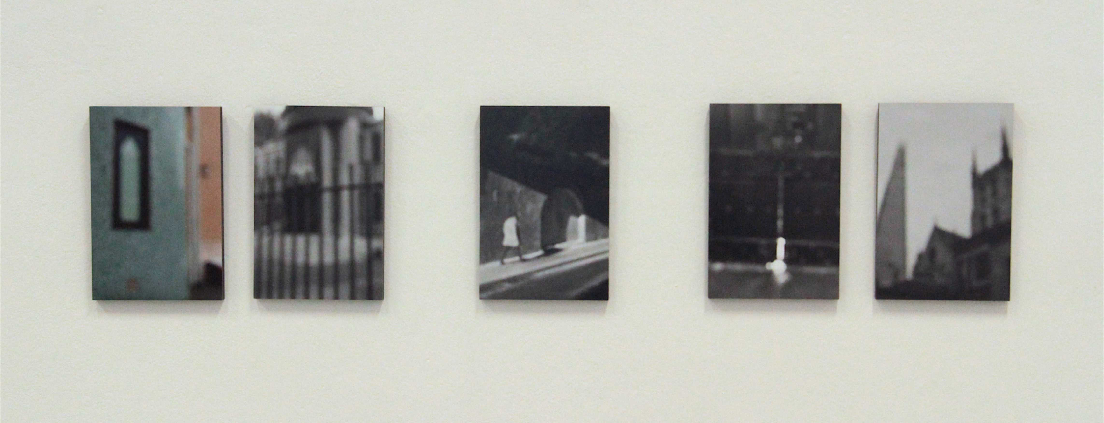
The photographs and the video installations were placed on the walls surrounding the cubes, so that the artistic approaches to the subject matter were always in sight when visitors were reading the text panels.
The cubes were made from recyclable cardboard, a natural material that reflects convertibility and that is easy to transport due to its light weight.
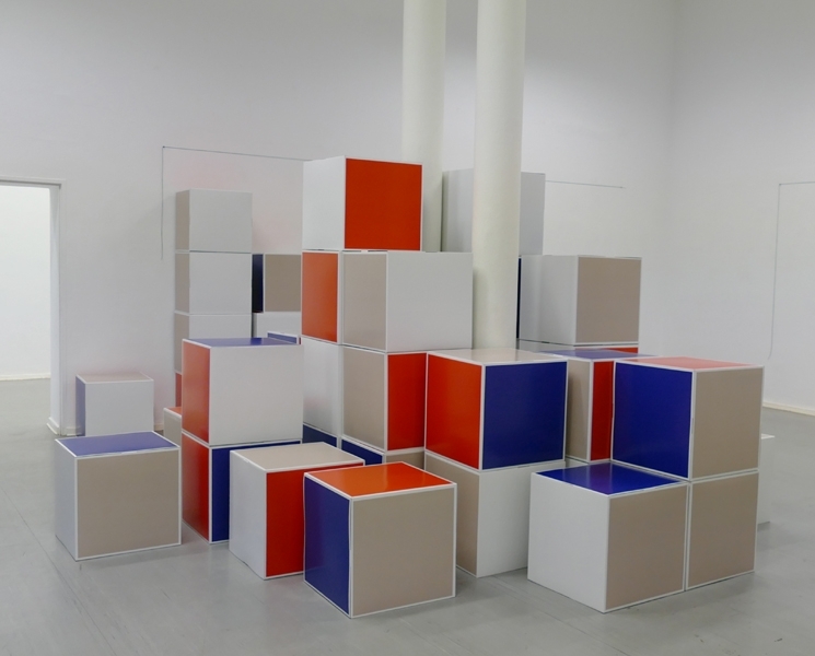
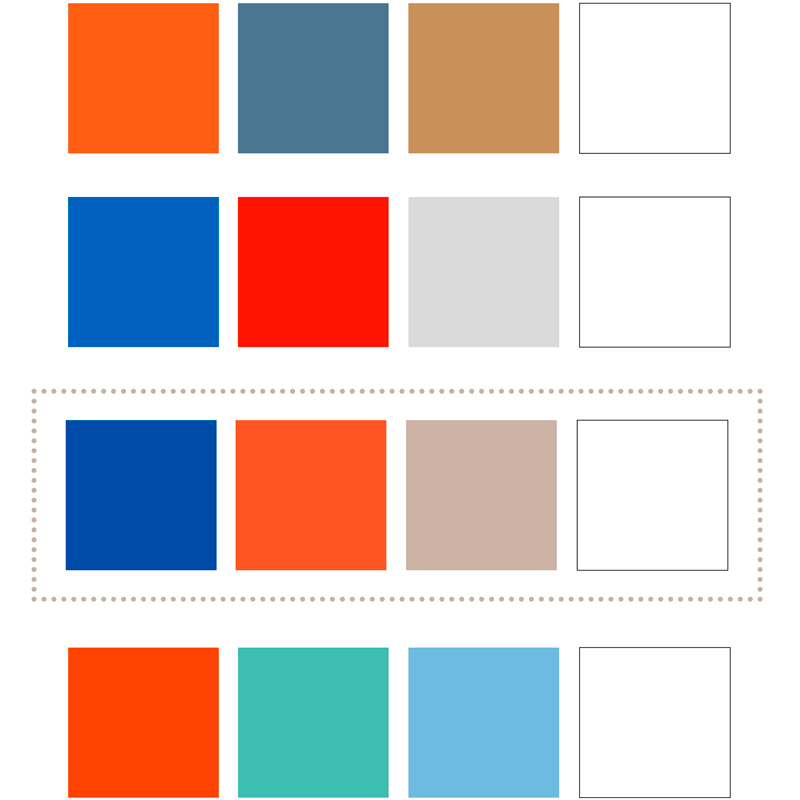
The thought behind the choice of colours for the cubes was to combine white with one muted, one lurid and one dark colour, providing the possibility for different accentuations depending on how one turns and places the cube. The final colour scheme consists of blue, orange and beige.
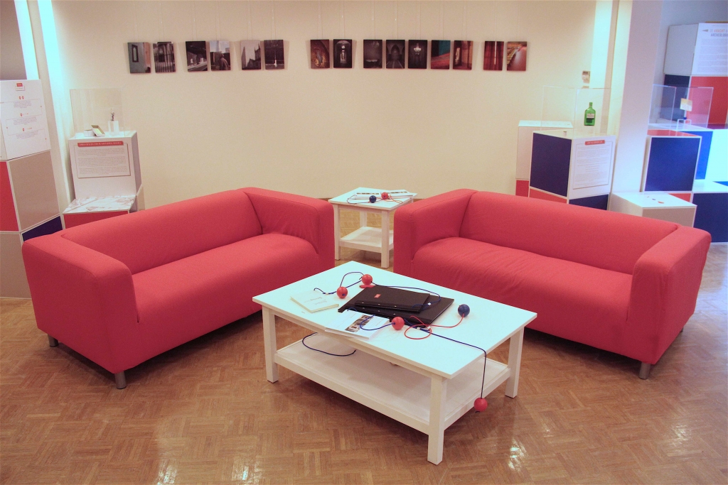
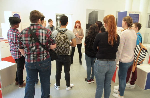
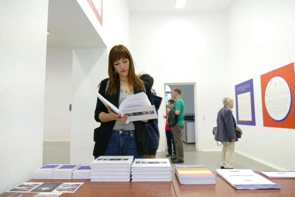
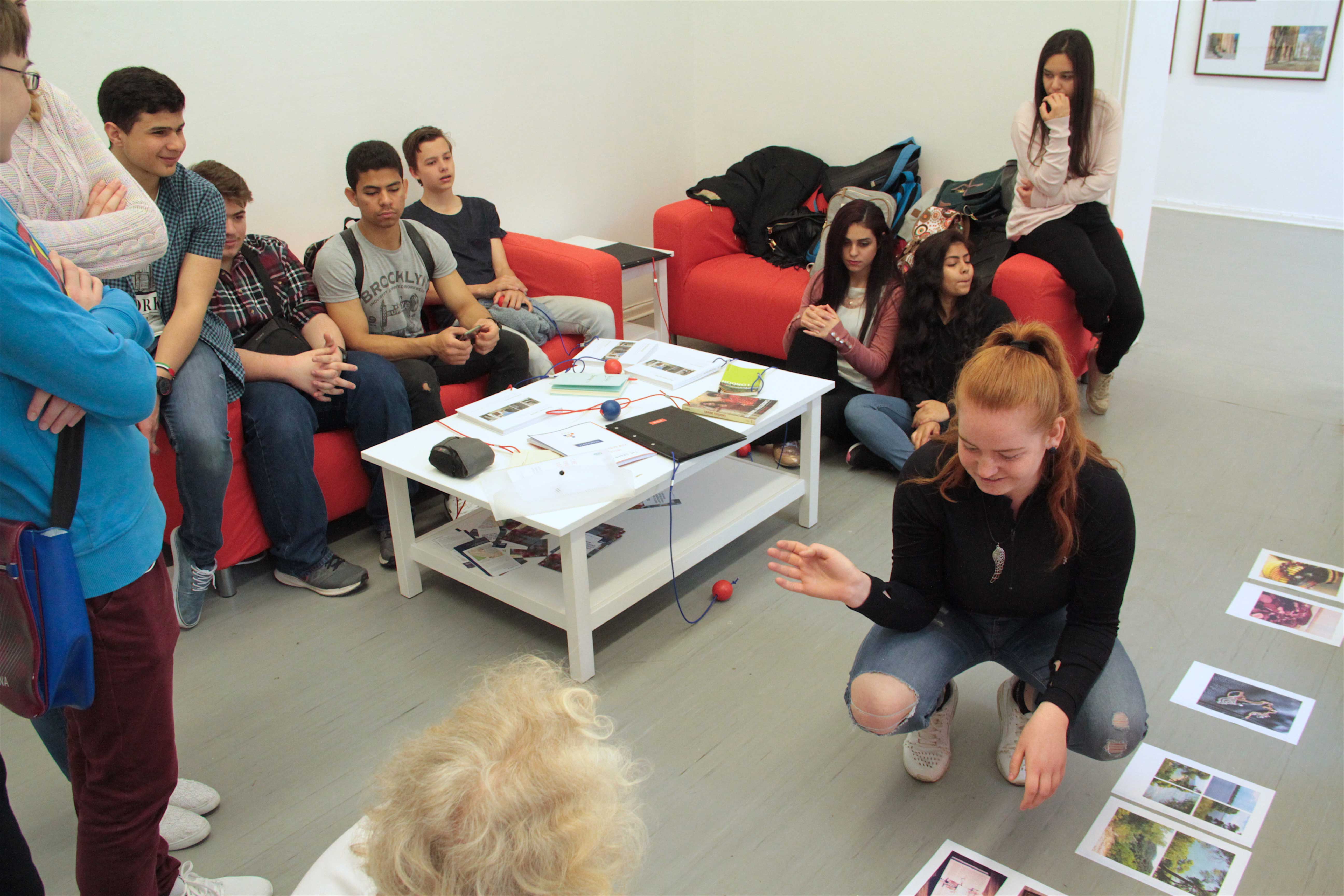
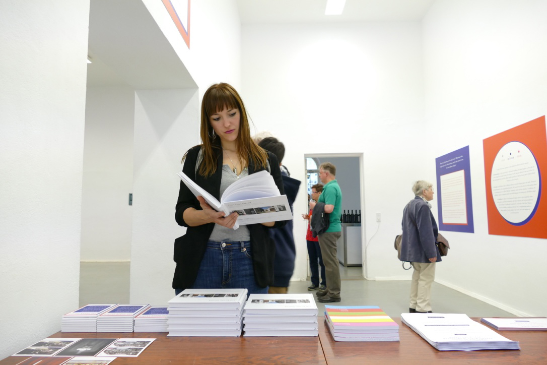
Since the main purpose of the exhibition was to transfer knowledge from scientific communities to the public, and given the vast amount of material that had been collected for each city and site, visitors were provided with the opportunity to engage with the content in more detail. In the “Reading Circle”, a sort of study space, visitors could sit down and take their time to read the exhibition catalogue, look at leaflets and brochures produced by or about the sites’ communities, or listen to interviews.


